Data communication and interactive visualization
GEOG 30323
April 16, 2024
Course recap
- Thus far: we’ve focused on exploratory data analysis, which involves data wrangling, summarization, and visualization
- Your data analysis journey shouldn’t stop here! Topics to consider:
- Explanatory vs. exploratory visualization
- Statistics and data science
- Data ethics and “big data”
Communicating with data
- Once you’ve done all of the hard work wrangling your data, you’ll want to communicate insights to others!
- This might include:
- Polished data products or reports
- Models that can scale your insights
Explanatory visualization
- We’ve largely worked to this point with exploratory visualization, which refers to internally-facing visualizations that help us reveal insights about our data
- Often, externally-facing data products will include explanatory visualization, which include a polished design and emphasize one or two key points
Infographics
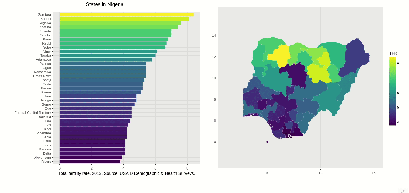
Obesity infographics:
Are infographics useful?
- XKCD: https://xkcd.com/1273/
Interactive reports
- Example: a data journalism article - or your Jupyter Notebook!
- Key distinction: your code, data exploration, etc. will likely be external to the report (this can vary depending on the context, however)
Data storytelling
Why interactive visualization?
- User is an active participant rather than a passive observer
- Key points to consider:
- What are you visualizing?
- What is the purpose of your visualization?
- Who is your audience?
- In what format and venue will you be presenting the visualization?
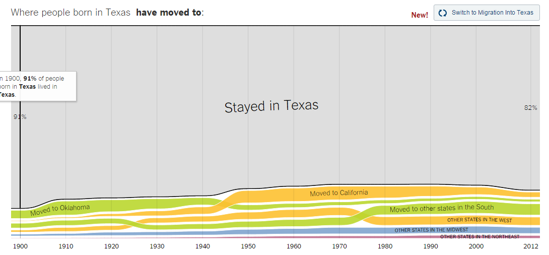
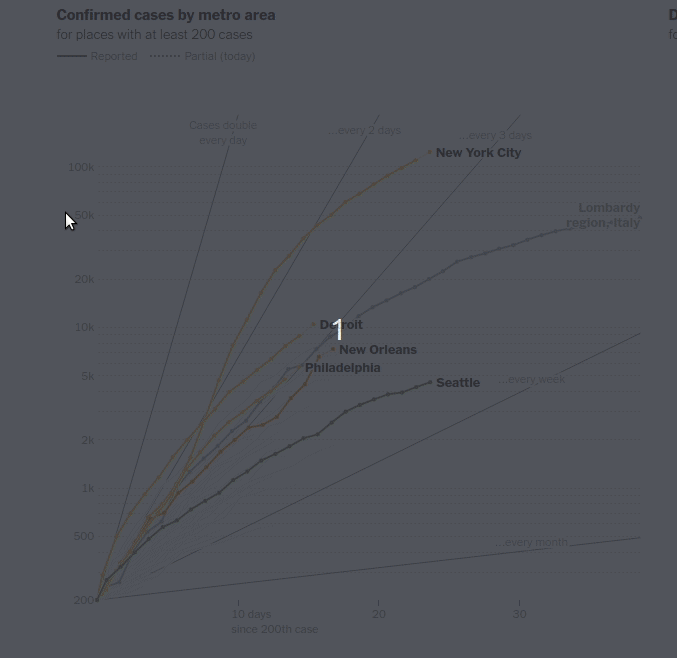
Interactive data journalism
Interactivity in the Notebook
- The
ipywidgetspackage allows you to build basic graphical user interfaces (GUIs) to explore your data in the Notebook - How it works: supply a function to the
interactfunction inipywidgets
Interactivity with plots
import pandas as pd
import seaborn as sns
import matplotlib.pyplot as plt

mx = pd.read_csv('http://personal.tcu.edu/kylewalker/mexico.csv')

cols = ['mus09', 'pri10', 'sec10', 'ter10', 'gdp08']

def make_plot(x, y, title):
    sns.lmplot(data = mx, x = x, y = y)
    plt.title(title)
    plt.show()

interact(make_plot, x = cols, y = cols, title = "Enter a plot title!")
Widgets: not just for plots!
Ipywidgets fundamentals
Arguments used in interact() correspond to the
following:
- A boolean (
TrueorFalse) returns a checkbox - A string returns a text input
- A number (integer or float) returns a slider
- A tuple of numbers (start, end, step size) returns a range slider
- A list returns a drop-down menu
Experiment with the functions you’ve written this semester!
Interactive visualization and the web
- Analytical workflows have become increasingly connected to the web - or even completely web-based
- Interactive data visualization: graphics not just on the web, but of the web
Filtering & highlighting
Linked charts
Interactive visualization in Python
Altair example
Tableau
![]()
- Highly popular software for data visualization - both exploratory and explanatory
- Intuitive, drag-and-drop interface
- Key feature: the dashboard
Data dashboards
Demo: Tableau Public
- Let’s work with a (cleaned) obesity dataset you’ll be familiar with from earlier in the semester; download it at https://personal.tcu.edu/kylewalker/data/overweight.csv